Card Select Interfaces
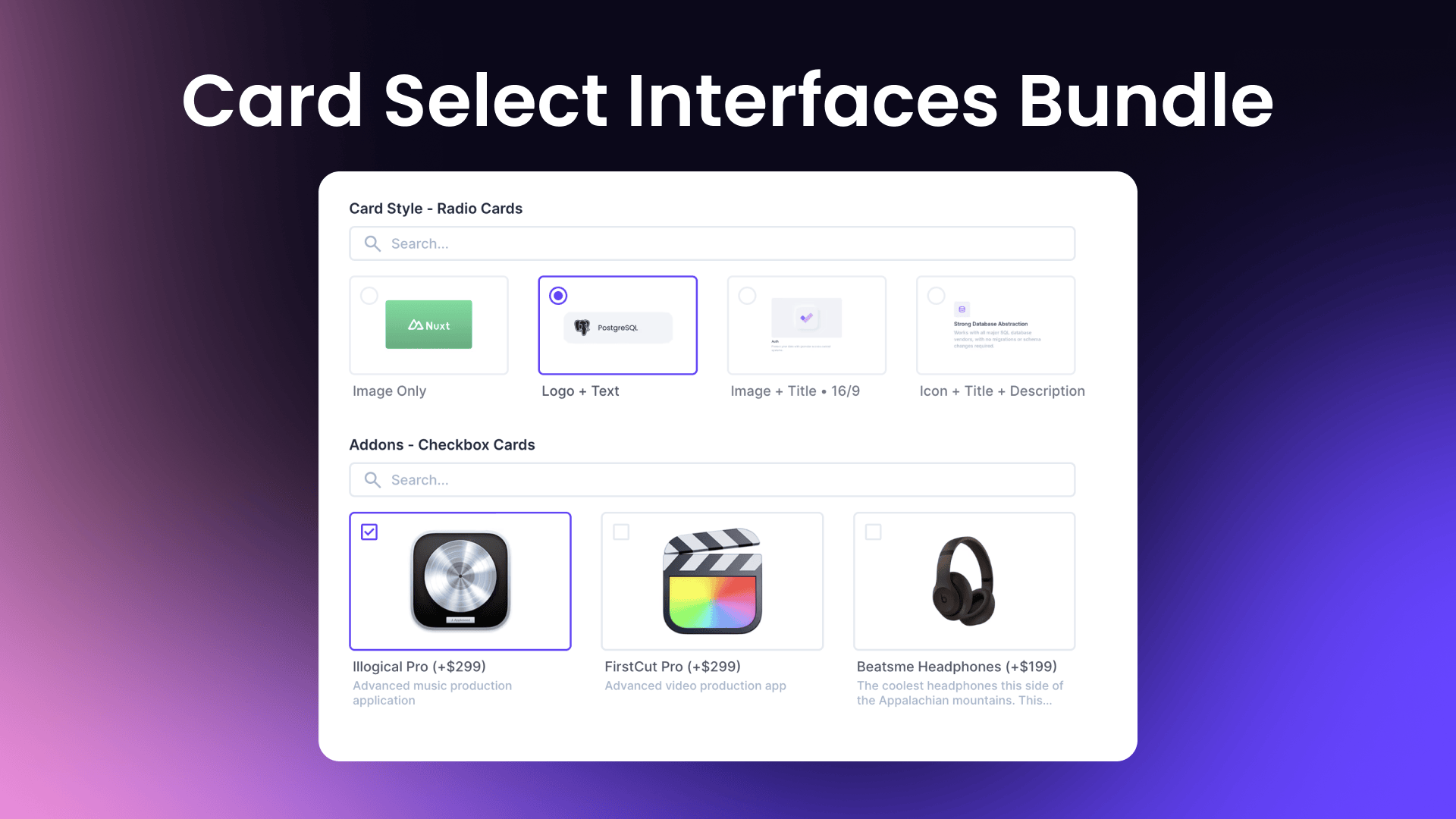
A bundle of card-based interfaces for Directus that provides selection options for both radio (single select) and checkbox (multiple select) inputs.
This bundle includes:
- Radio Cards Interface
- Checkbox Cards Interface
Installation
To install the extension, follow the Official Guide for installing extensions from the Marketplace or manually.
Interfaces
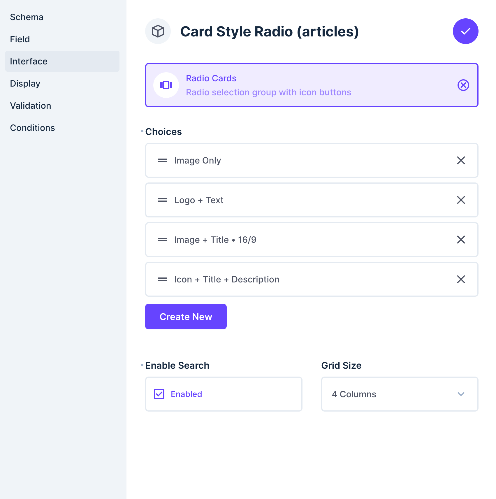
Radio Cards Interface
A card-based single selection interface that replaces the standard radio button input with visually appealing cards. Perfect for when you want to provide users with rich visual choices. Supports single selection.
Field Types: String, Integer, Float, Decimal, Big Integer

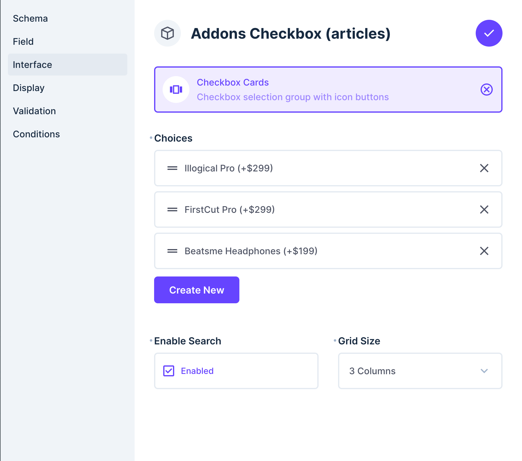
Checkbox Cards Interface
A card-based multiple selection interface that replaces standard checkboxes with interactive cards. Ideal for allowing users to select multiple options in a more engaging way. Supports multiple selections.
Field Types: JSON, CSV

Configuration Options
- Choices - A list of card options with the following properties for each:
- Text - Label to show in the studio interface
- Value - Value to be stored in the database
- Description - Optional description to display below the text label
- Icon Type - Choose between:
- Icon - Use a Directus system icon
- SVG - Use custom SVG markup
- Image - Use an uploaded image
- Icon/SVG/Image - The actual icon content based on selected type
- Grid Size - Number of columns in the grid layout (2-6 columns)
- Enable Search - Toggle search functionality to filter cards by text