directus-extension-theme-settings
Theme Settings Interface Directus Extension: Visually Configure Your Frontend Theme Colors, Fonts, and More
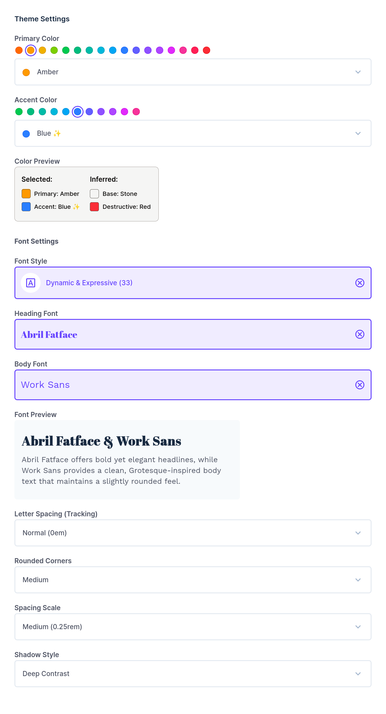
Interface for choosing harmonized primary & accent colors, font pairings, shadows, rounded corners and more.
Integration examples for Nuxt with shadcn-vue and Nuxt UI below.
✨ Features
This extension provides a user-friendly interface within Directus to configure your frontend’s theme:
- Color Theme Picker: Select accent and primary colors to define your project’s color palette. Uses TailwindCSS v4 color shades. Recommends best color pairings for beautiful color harmony.
- Font Pair Picker: Choose from a curated list of 150+ font pairings for headings and body text.
- Rounded Corner Radius Picker: Define the default border radius for UI elements.
- Spacing Picker: Set the base spacing unit, affecting margins, padding, and layout.
- Letter Spacing (Tracking) Picker: Adjust the letter spacing for text elements.
- Shadow Picker: Select from predefined shadow styles for depth and emphasis.
⚙️ Installation
- Navigate to the App Marketplace in your Directus project.
- Search for “Theme Settings” extension.
- Click “Install”.
Alternatively, you can install this extension manually by downloading the latest release and placing it in your Directus project’s extensions/ directory.
🚀 Usage
Once installed, you can add the “Theme Settings” interface to a JSON field in any of your collections.
- Create a new field in your desired collection (e.g., a “Global Settings” collection). I like to call it
theme_settings. - Set the field type to JSON.
- Under “Interface”, select “Theme Settings”.
The extension will store its output as a JSON object in this field, which includes:
- Selected values for colors, fonts, radius, spacing, tracking, and shadows.
- On save, the
cssTextvalue is generated and saved inside the JSON object oftheme_settingsfield (or the field name you chose).
Example cssText generated CSS -> theme-generated-example.css.
🎨 Using the generated CSS in your Nuxt 3 (or 4) project
Currently, I am including only Vue 3 / Nuxt 3 integration examples for shadcn and nuxt/ui. Please contribute other framework or UI lib examples like Next.js, SvelteKit, etc. Thank you 🤩
Now, let’s automate copying the generated CSS into your Nuxt 3 (compatibilityVersion: 4) project.
To do so, copy the server plugin fetch-theme-css.ts to your server/plugins/ folder. This will write the CSS generated to app/assets/css/theme-generated.css.
Don’t forget to define DIRECTUS_URL and DIRECTUS_SERVER_TOKEN in your .env file:
DIRECTUS_URL=http://your-directus-instance.com
DIRECTUS_SERVER_TOKEN=your_directus_server_token
To get the
DIRECTUS_SERVER_TOKEN, create a newfrontend-botuser in Directus with the proper permissions to read thetheme_settingsfield. Then, generate a server token for this user in the Directus admin panel.
Using the generated CSS with shadcn-vue
-
To use the generated CSS with shadcn-vue, make sure it’s installed and configured along with TailwindCSS v4.
-
Add the file
theme-shadcn.cssto yourapp/assets/css/theme-shadcn.css, which importstheme-generated.cssand maps the CSS variables to shadcn-vue’s theme variables. -
Import
theme-shadcn.cssfrom yourtailwind.cssfile and add the@themedirective:
@import "tailwindcss";
@import "./theme-shadcn.css";

/* shadcn theme. See https://www.shadcn-vue.com/docs/theming.html */
@theme inline {
  --color-background: hsl(var(--background));
  --color-foreground: hsl(var(--foreground));
  --color-card: hsl(var(--card));
  --color-card-foreground: hsl(var(--card-foreground));
  --color-popover: hsl(var(--popover));
  --color-popover-foreground: hsl(var(--popover-foreground));
  --color-primary: hsl(var(--primary));
  --color-primary-foreground: hsl(var(--primary-foreground));
  --color-secondary: hsl(var(--secondary));
  --color-secondary-foreground: hsl(var(--secondary-foreground));
  --color-muted: hsl(var(--muted));
  --color-muted-foreground: hsl(var(--muted-foreground));
  --color-accent: hsl(var(--accent));
  --color-accent-foreground: hsl(var(--accent-foreground));
  --color-destructive: hsl(var(--destructive));
  --color-destructive-foreground: hsl(var(--theme-destructive-foreground));
  --color-border: hsl(var(--border));
  --color-input: hsl(var(--input));
  --color-ring: hsl(var(--ring));
  --color-chart-1: hsl(var(--chart-1));
  --color-chart-2: hsl(var(--chart-2));
  --color-chart-3: hsl(var(--chart-3));
  --color-chart-4: hsl(var(--chart-4));
  --color-chart-5: hsl(var(--chart-5));

  --color-sidebar: hsl(var(--sidebar));
  --color-sidebar-foreground: hsl(var(--sidebar-foreground));
  --color-sidebar-primary: hsl(var(--sidebar-primary));
  --color-sidebar-primary-foreground: hsl(var(--sidebar-primary-foreground));
  --color-sidebar-accent: hsl(var(--sidebar-accent));
  --color-sidebar-accent-foreground: hsl(var(--sidebar-accent-foreground));
  --color-sidebar-border: hsl(var(--sidebar-border));
  --color-sidebar-ring: hsl(var(--sidebar-ring));

  /* ---- Additional directus-extension-theme-settings variables ---- */
  /* Border Radius */
  --radius-sm: calc(var(--theme-radius, 0.25rem) - 4px);
  --radius-md: calc(var(--theme-radius, 0.25rem) - 2px);
  --radius-lg: var(--theme-radius, 0.25rem);
  --radius-xl: calc(var(--theme-radius, 0.25rem) + 4px);

  /* Fonts */
  --font-serif: var(--theme-font-family-heading), ui-serif, Georgia, Cambria,
    "Times New Roman", Times, serif;
  --font-heading: var(--font-serif);

  --font-sans: var(--theme-font-family-body), ui-sans-serif, system-ui,
    sans-serif, "Apple Color Emoji", "Segoe UI Emoji", "Segoe UI Symbol",
    "Noto Color Emoji";
  --font-body: var(--font-sans);

  /* Shadow */
  --shadow-2xs: var(--theme-shadow-2xs);
  --shadow-xs: var(--theme-shadow-xs);
  --shadow-sm: var(--theme-shadow-sm);
  --shadow: var(--theme-shadow);
  --shadow-md: var(--theme-shadow-md);
  --shadow-lg: var(--theme-shadow-lg);
  --shadow-xl: var(--theme-shadow-xl);
  --shadow-2xl: var(--theme-shadow-2xl);

  /* Letter Spacing (Tracking) */
  --tracking-tighter: calc(var(--theme-tracking) - 0.05em);
  --tracking-tight: calc(var(--theme-tracking) - 0.025em);
  --tracking-normal: var(--theme-tracking);
  --tracking-wide: calc(var(--theme-tracking) + 0.025em);
  --tracking-wider: calc(var(--theme-tracking) + 0.05em);
  --tracking-widest: calc(var(--theme-tracking) + 0.1em);
}

/* Apply spacing. See https://tailwindcss.com/docs/padding */
:root {
  --spacing: var(--theme-spacing, 0.25rem);
}

/* Apply letter-spacing (tracking) */
@layer base {
  body {
    letter-spacing: var(--tracking-normal);
  }
}
Using the generated CSS with Nuxt UI
- Make sure you set up
fetch-theme-css.tsin your project to generate the CSS file. - Configure Nuxt UI + TailwindCSS v4. See Nuxt UI documentation for installation and set up.
- Add the custom theme settings to your
tailwind.cssfile:
@import "tailwindcss";
@import "@nuxt/ui";

@import "./theme-generated.css";

/* Define selected colors from directus-extension-theme-settings */
@theme static inline {
  --color-theme-primary: hsl(var(--theme-primary-500));
  --color-theme-primary-50: hsl(var(--theme-primary-50));
  --color-theme-primary-100: hsl(var(--theme-primary-100));
  --color-theme-primary-200: hsl(var(--theme-primary-200));
  --color-theme-primary-300: hsl(var(--theme-primary-300));
  --color-theme-primary-400: hsl(var(--theme-primary-400));
  --color-theme-primary-500: hsl(var(--theme-primary-500));
  --color-theme-primary-600: hsl(var(--theme-primary-600));
  --color-theme-primary-700: hsl(var(--theme-primary-700));
  --color-theme-primary-800: hsl(var(--theme-primary-800));
  --color-theme-primary-900: hsl(var(--theme-primary-900));
  --color-theme-primary-950: hsl(var(--theme-primary-950));
  --color-theme-primary-text: hsl(var(--theme-primary-text));

  --color-theme-accent: hsl(var(--theme-accent-500));
  --color-theme-accent-50: hsl(var(--theme-accent-50));
  --color-theme-accent-100: hsl(var(--theme-accent-100));
  --color-theme-accent-200: hsl(var(--theme-accent-200));
  --color-theme-accent-300: hsl(var(--theme-accent-300));
  --color-theme-accent-400: hsl(var(--theme-accent-400));
  --color-theme-accent-500: hsl(var(--theme-accent-500));
  --color-theme-accent-600: hsl(var(--theme-accent-600));
  --color-theme-accent-700: hsl(var(--theme-accent-700));
  --color-theme-accent-800: hsl(var(--theme-accent-800));
  --color-theme-accent-900: hsl(var(--theme-accent-900));
  --color-theme-accent-950: hsl(var(--theme-accent-950));
  --color-theme-accent-text: hsl(var(--theme-accent-text));

  --color-theme-destructive: hsl(var(--theme-destructive-500));
  --color-theme-destructive-50: hsl(var(--theme-destructive-50));
  --color-theme-destructive-100: hsl(var(--theme-destructive-100));
  --color-theme-destructive-200: hsl(var(--theme-destructive-200));
  --color-theme-destructive-300: hsl(var(--theme-destructive-300));
  --color-theme-destructive-400: hsl(var(--theme-destructive-400));
  --color-theme-destructive-500: hsl(var(--theme-destructive-500));
  --color-theme-destructive-600: hsl(var(--theme-destructive-600));
  --color-theme-destructive-700: hsl(var(--theme-destructive-700));
  --color-theme-destructive-800: hsl(var(--theme-destructive-800));
  --color-theme-destructive-900: hsl(var(--theme-destructive-900));
  --color-theme-destructive-950: hsl(var(--theme-destructive-950));
  --color-theme-destructive-text: hsl(var(--theme-destructive-text));

  --color-theme-base: hsl(var(--theme-base-500));
  --color-theme-base-50: hsl(var(--theme-base-50));
  --color-theme-base-100: hsl(var(--theme-base-100));
  --color-theme-base-200: hsl(var(--theme-base-200));
  --color-theme-base-300: hsl(var(--theme-base-300));
  --color-theme-base-400: hsl(var(--theme-base-400));
  --color-theme-base-500: hsl(var(--theme-base-500));
  --color-theme-base-600: hsl(var(--theme-base-600));
  --color-theme-base-700: hsl(var(--theme-base-700));
  --color-theme-base-800: hsl(var(--theme-base-800));
  --color-theme-base-900: hsl(var(--theme-base-900));
  --color-theme-base-950: hsl(var(--theme-base-950));
  --color-theme-base-text: hsl(var(--theme-base-text));

  /* ---- Additional directus-extension-theme-settings variables ---- */
  /* Fonts */
  --font-serif: var(--theme-font-family-heading), ui-serif, Georgia, Cambria,
    "Times New Roman", Times, serif;
  --font-heading: var(--font-serif);

  --font-sans: var(--theme-font-family-body), ui-sans-serif, system-ui,
    sans-serif, "Apple Color Emoji", "Segoe UI Emoji", "Segoe UI Symbol",
    "Noto Color Emoji";
  --font-body: var(--font-sans);

  /* Shadow */
  --shadow-2xs: var(--theme-shadow-2xs);
  --shadow-xs: var(--theme-shadow-xs);
  --shadow-sm: var(--theme-shadow-sm);
  --shadow: var(--theme-shadow);
  --shadow-md: var(--theme-shadow-md);
  --shadow-lg: var(--theme-shadow-lg);
  --shadow-xl: var(--theme-shadow-xl);
  --shadow-2xl: var(--theme-shadow-2xl);

  /* Letter Spacing (Tracking) */
  --tracking-tighter: calc(var(--theme-tracking) - 0.05em);
  --tracking-tight: calc(var(--theme-tracking) - 0.025em);
  --tracking-normal: var(--theme-tracking);
  --tracking-wide: calc(var(--theme-tracking) + 0.025em);
  --tracking-wider: calc(var(--theme-tracking) + 0.05em);
  --tracking-widest: calc(var(--theme-tracking) + 0.1em);
}

:root {
  /* Apply radius. See https://ui.nuxt.com/getting-started/theme#radius */
  --ui-radius: var(--theme-radius, 0.25rem);

  /* Apply spacing. See https://tailwindcss.com/docs/padding */
  --spacing: var(--theme-spacing1, 0.25rem);
}

/* Apply letter-spacing (tracking) */
@layer base {
  body {
    letter-spacing: var(--tracking-normal);
  }
}
- Finally, update your
app.config.tsfile to use the new colors:
export default defineAppConfig({
  ui: {
    colors: {
      primary: "theme-primary",
      secondary: "theme-accent",
      neutral: "theme-base",
      error: "theme-destructive",
    },
  },
});
🤩 Contributing
Contributions are welcome! Please feel free to submit a pull request or open an issue for bugs, feature requests, or improvements.
I would appreciate help adding more integration examples for other frameworks like Next.js, SvelteKit, as well as other UI libraries.
📄 License
This extension is licensed under the MIT License.